The starting point
A very large catalog, one listing at a time
Every product listing on Walmart's website depends on its content, and when that content is missing or weak, customers struggle to find a product or decide whether it is right for them.
Walmart's category specialists each owned a part of the catalog, and the Content Quality Dashboard was their tool for seeing where listings fell short.
Its legacy version was incredibly basic, dated and very difficult to navigate, with none of the advanced, AI-based content review features, and it only flagged basic things, such as missing content.
The opportunity was to help specialists move from knowing a score to knowing what to change.
What changed
A dashboard rebuilt from the ground up
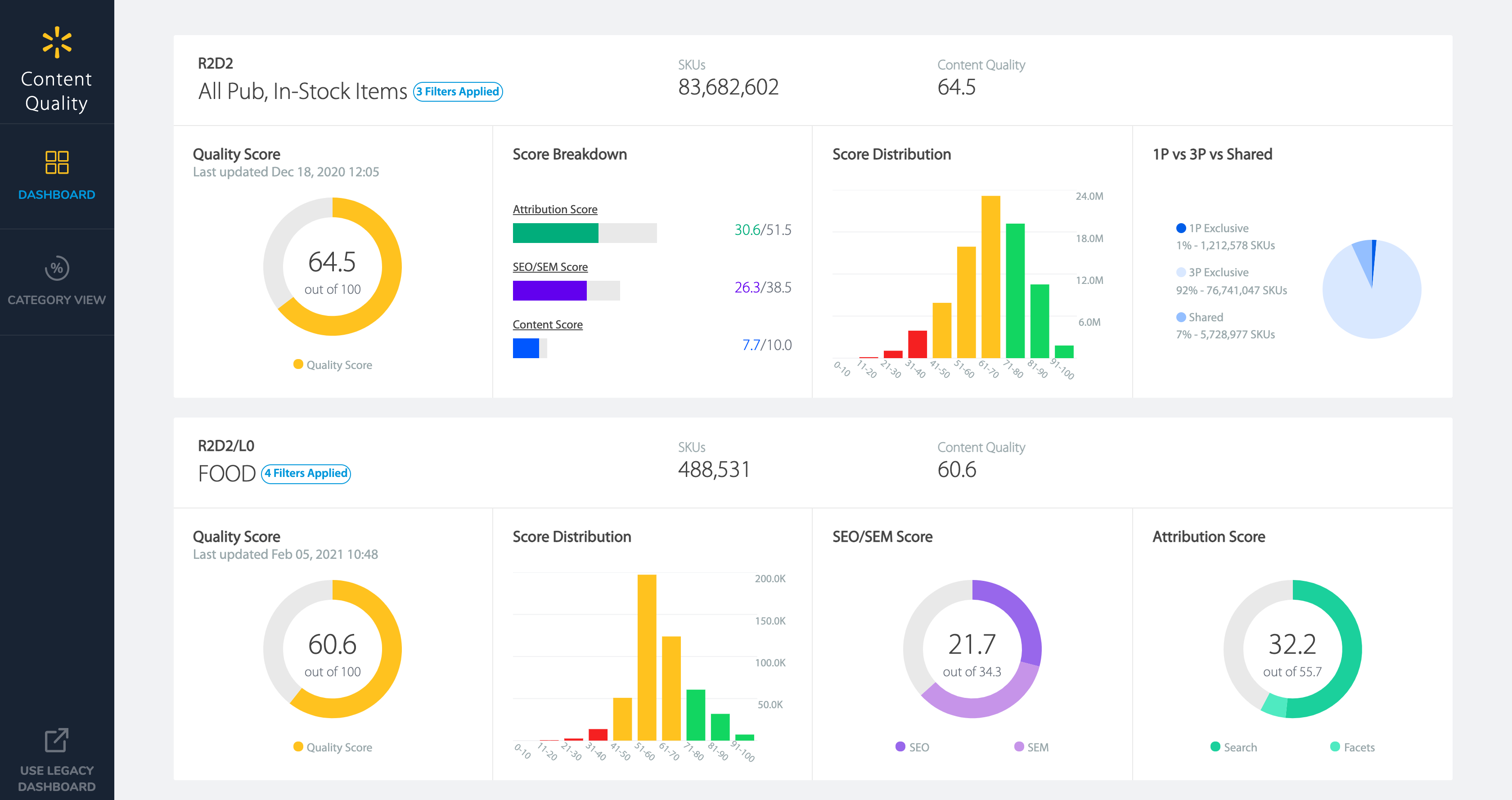
We completely overhauled the interface, breaking the quality score into its parts (attribution, search and content) and showing how scores were spread across a category.
Specialists could filter to their own categories, save those views, and move from a category into the specific attributes and items affecting its score.
Both screens below were captured on the same day in February 2021 and measure different sets of items, so they compare two tools rather than showing change over time.
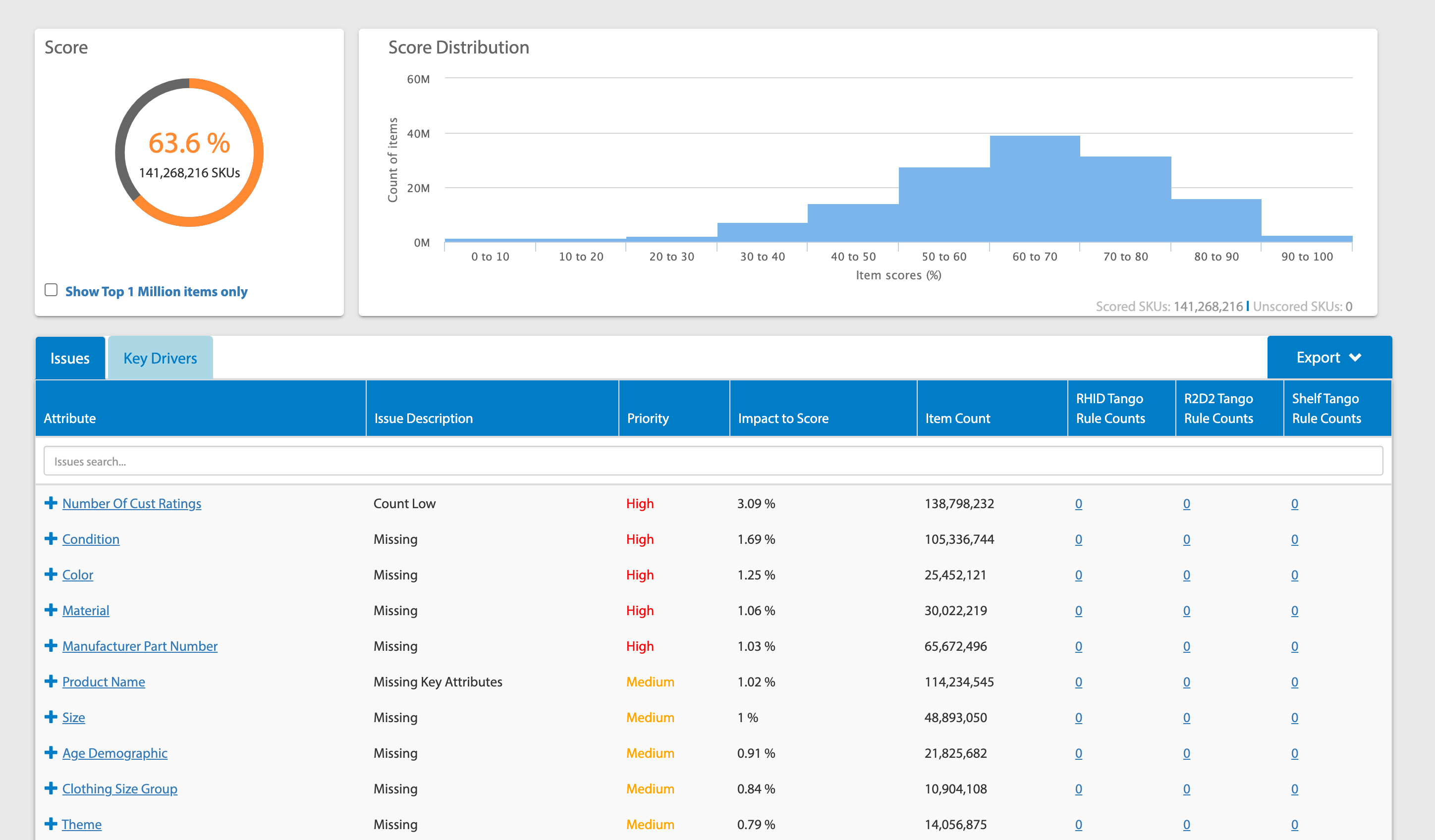
The legacy dashboard: one overall score and a long table of missing attributes.
The redesigned dashboard: the score broken into its parts, with distribution and seller views for each saved category.
Recommendations, not only scores
A score shows where a problem is, not what to do about it, so we developed AI algorithms that reviewed listing content, including product titles, images and descriptions, and gave specific recommendations for improving it.
We also launched Content Quality-Powered Content Selection, which used proprietary algorithms to automate what content is shown to customers.
Putting insights in front of sellers
Many listings come from the suppliers and sellers who know those products best, so we took the insights to them as well.
With other product teams, we launched content-quality feedback in vendor-facing apps, and a content-quality integration in Marketplace's seller application gave sellers recommendations for improving their own listings.
Listing Quality in Marketplace's seller application
$24M in GMV generated in the 6 months after launch
- listings updated
- 212.5K
- Listing Quality score of the updated listings
- 41% → 48%
- items received page views for the first time
- 21,238
- items received orders for the first time
- 26,053
Results
A better catalog, and a business result
The Catalog Content Quality score increased 16% across 82M items during my time on the product, reflecting a general improvement in listings across Walmart's catalog.
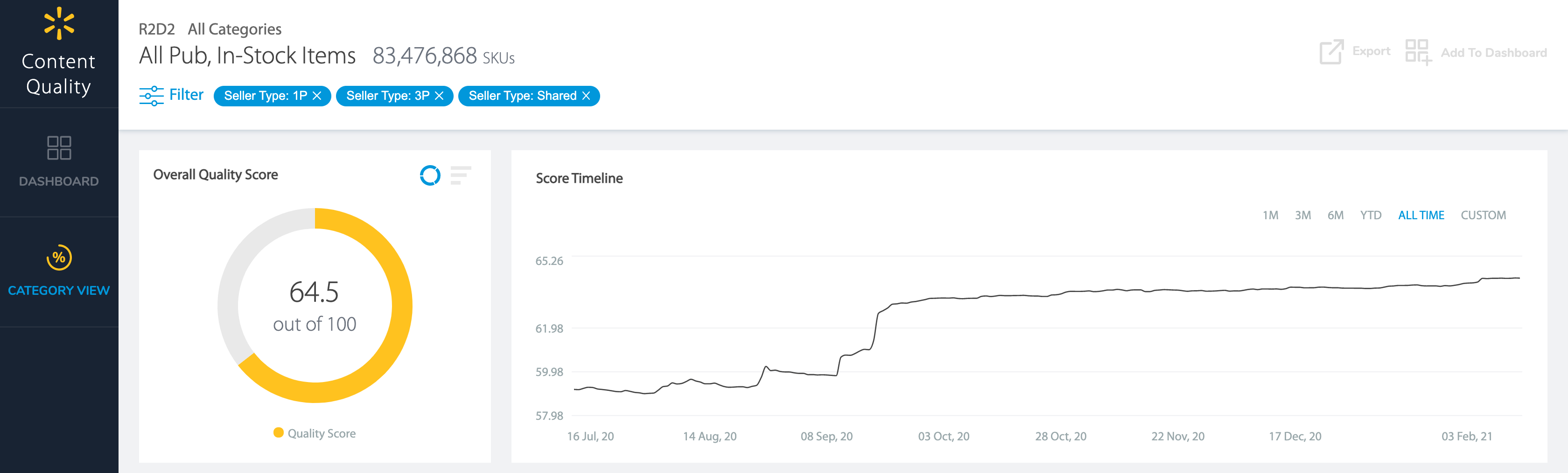
Score Timeline
Dashboard users grew 2X from fall 2019 to spring 2020, and average monthly active users increased 32% in 2020.
Beyond the dashboard, results showed a 27% increase in orders and a 50% increase in page views on items that were actioned on after receiving feedback in vendor-facing apps.
$24M in GMV was generated in 6 months after we launched the Marketplace integration. For Content Quality-Powered Content Selection, results showed a 5% increase to conversion.
Internal figures from my employment at Walmart, describing the work of the whole team, not consulting outcomes. Where no period was recorded, the result was measured during my time on the product. GMV, or gross merchandise value, is the value of goods sold, not revenue; Net Promoter Score measures how likely users are to recommend a product.
Let's talk about your teamMy role
I owned the dashboard directly, as a PM rather than a manager of PMs. I also drove 2 proprietary content evaluation algorithms from conception to launch and filed patents on them.